PlaySnap launched with a pretty generic look. A pop art / comic book theme felt like an obvious fit — SNAP is already a word that belongs in a speech bubble — so that's what this session was.
- The reskin decision came down to the name. "Snap" is a comic book word. Pop art was the obvious direction and it gave a clear brief: bold fonts, hard edges, no soft gradients.
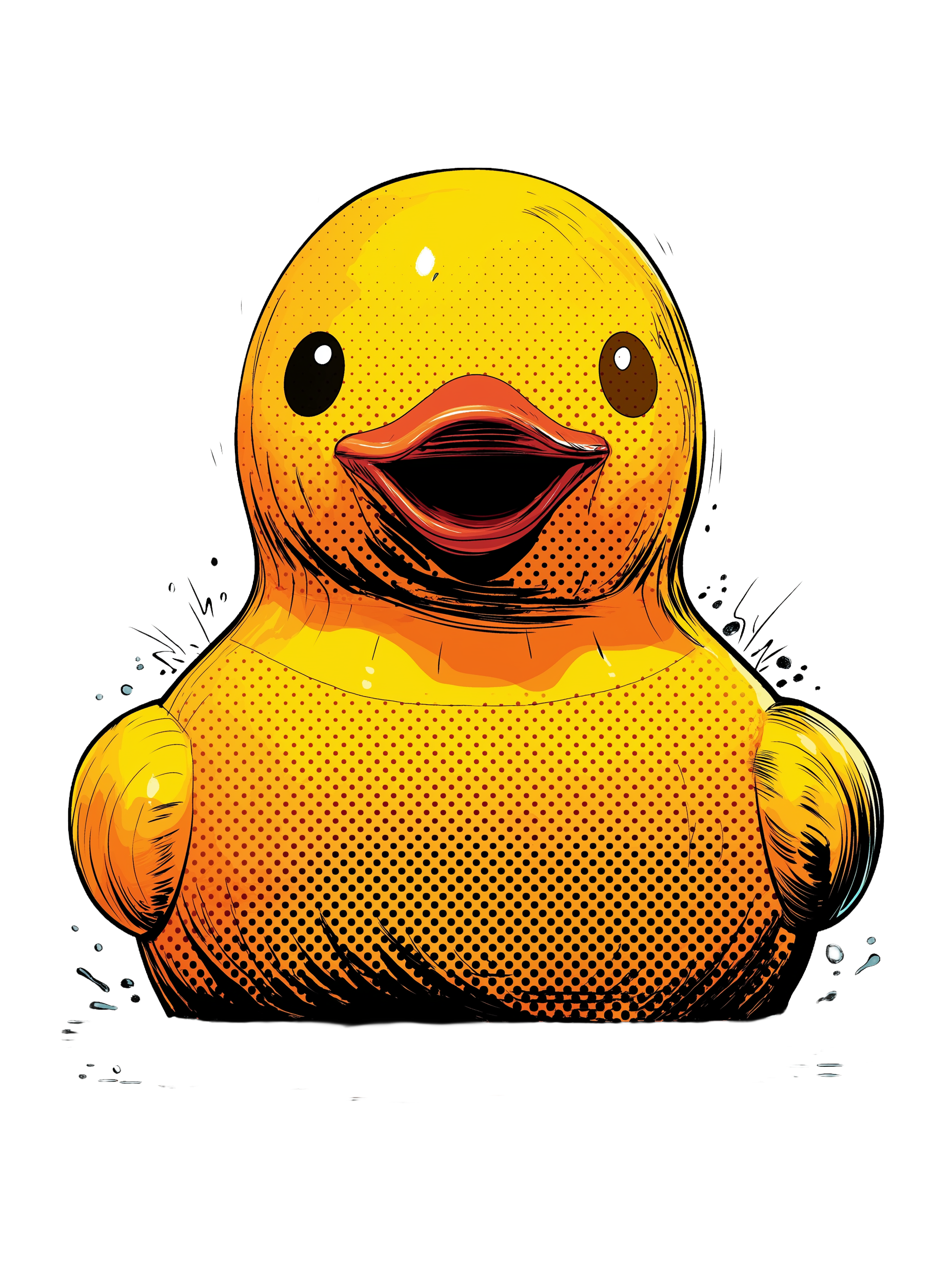
- All the illustrated assets — the SNAP button, success and fail images, win and lose banners, the social share OG image — were created in Midjourney. It's been genuinely useful for this kind of thing, but getting what you actually want out of it takes a lot of prompting iterations. You can spend a long time generating variations before landing on something that works in context.
- Win and lose modals now pick randomly from five banner images each, so you don't see the same one every game. That came out of having too many good Midjourney outputs to pick just one.
- The WhatsApp share preview was a saga. The OG image wasn't showing — turned out WhatsApp had cached the old one and wouldn't let go. The fix involved converting the image to JPEG (WhatsApp is picky about formats) and adding a cache-bust query string to force a re-scrape. Two PRs just for that.
- A bunch of smaller things got tidied up once the new theme was in: font choices, button layout, the pile shadow, font sizes across the UI. That's the usual pattern — a big visual change exposes a load of things that now look slightly off.